
What does the Lexus logo represent
July 22 2022,
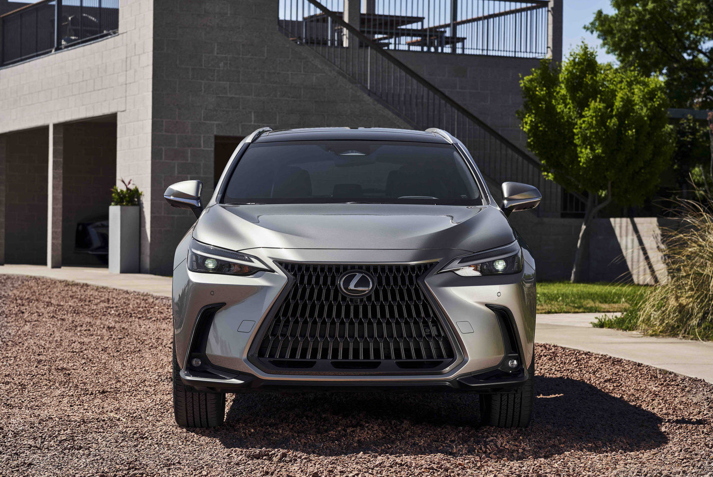
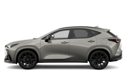
The Lexus logo has become one of the most recognizable not just in the car business, but in branding as a whole. That stylized “L” with an oval surrounding it? So simple, yet so effective.
The “L” portion is obvious; the brand name starts with one (although if they’d gone with the original name – “Alexis” – they wouldn’t have obviously had to change things) but it’s also shaped to look like a curve you might come across on the road you’re luxuriously traversing. So not only is it a letter, but it conveys a sense of adventure as well. Further still, its aerodynamic shape reflects the modern, aerodynamic shape of the may cars Lexus produces.
On the surface, however, it’s almost the simplicity of it all that really does it. A simple silver-grey finish on a stylized “L”, surrounded by an oval that could be the outline of the earth, or simply the representation of a circuitous route that has brought you there and back again in your Lexus. While so man other car logos have gone through a number of changes through the years, Lexus has stayed true to their original design even as their vehicles have gotten larger, more aerodynamic, more sophisticated. There was no need to change it; it just…works.
There have been slight modifications, of course; all hybrid Lexus models get a blue hue around the logo both front and back, which is a tasteful way of showing that this particular Lexus is a little different. It’s also matched with the “h” badge that adorns all hybrid models, which makes for a nice tie-in.
Even as trends transition to more text being used in place of logos, the famous “L” will remain. It is more than just a car logo; it is the symbol worn by one of the first luxury manufacturers hailing from someplace other than the United States, Germany or the UK and thus a pioneer in its own right.